Map Portfolio
-
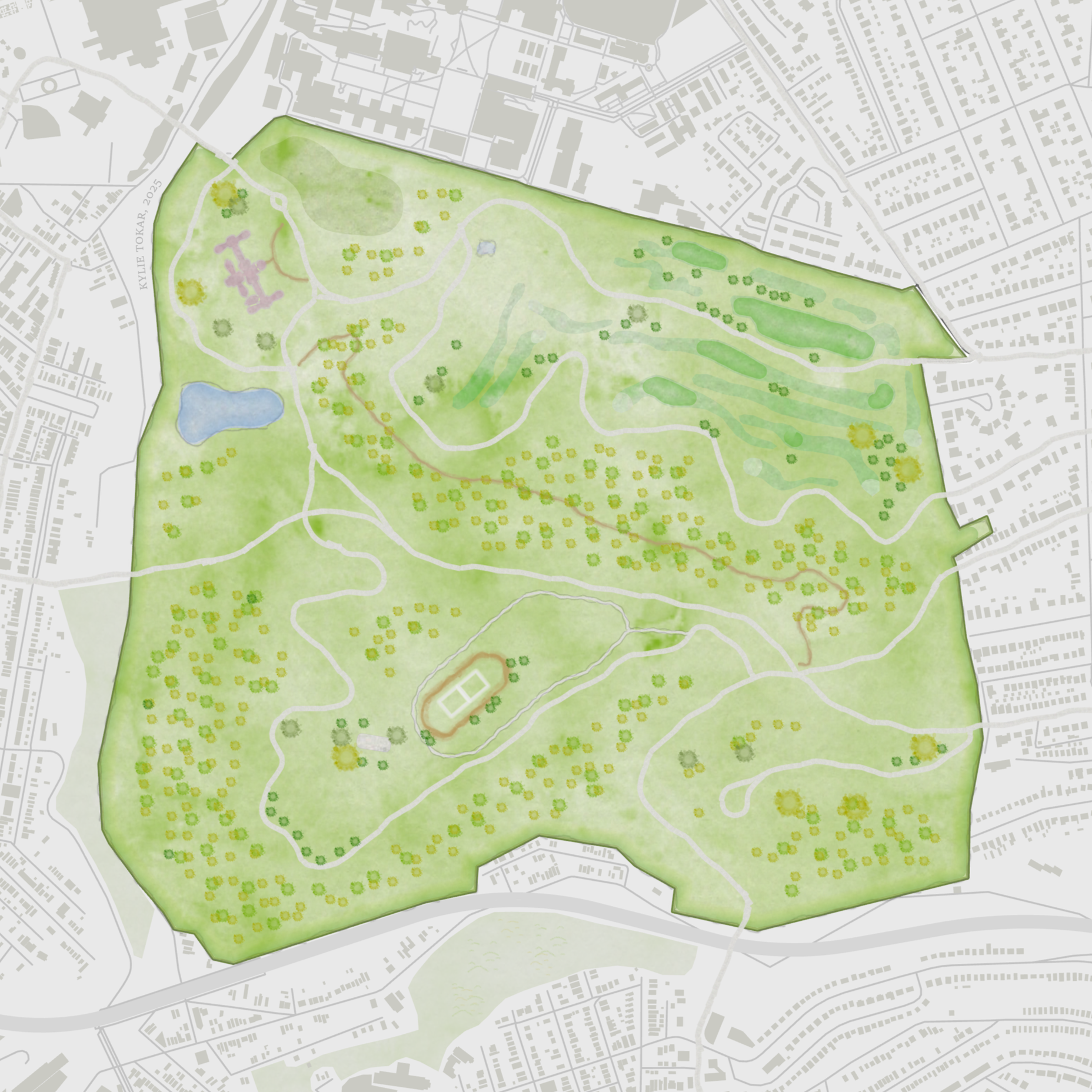
Designed in GIS using custom symbology (highly influenced by John Nelson’s Watercolor Style kit), this map depicts one of Pittsburgh’s beloved city parks. Available in print!

-
This map is more artistic than utilitarian, depicting both the basic anatomy of the iconic monarch butterfly and the mirroring geography of Pittsburgh, PA.

-
This realtor was in need of a map displaying not only the Carolina Trace community, but all of its amenities, including Property Owner's Associations, pools, and golf courses.

-
This map is an ode to the 100+ species of salamander present in the Appalachian region; I challenged myself to explore some uncommon styles and cartographic techniques for the sake of creativity!
-
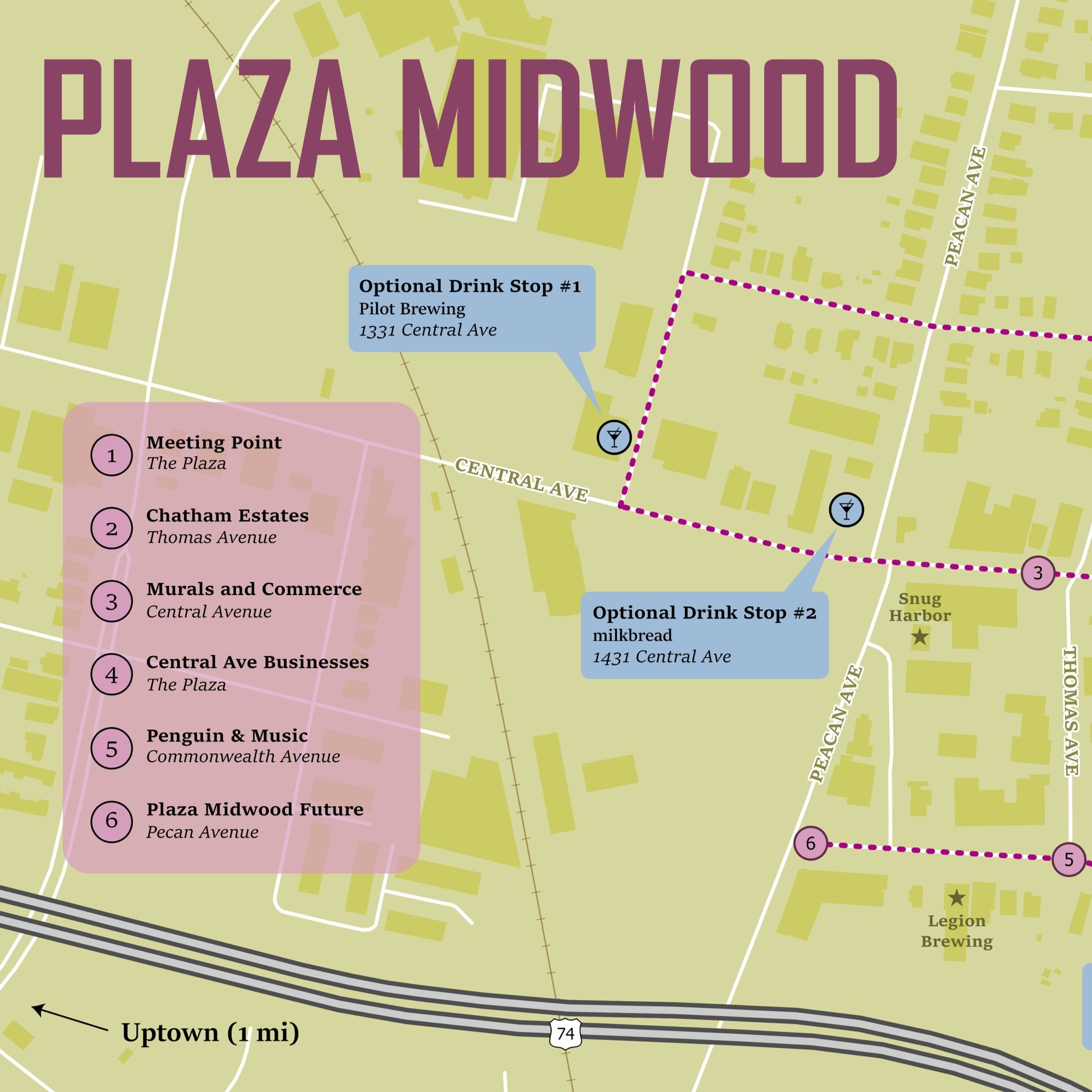
The stops and route on this walking tour were carefully curated by the tour guide, and this map was developed through a thoughtful iterative feedback cycle. We tested out several style types before settling on fonts and color scheme; the ultimate selection aligns with an additional city-wide map I created to orient tour participants to the neighborhood.

-
This was a fun exercise in replicating a subway style map, but using the interstates of Pennsylvania instead of rail lines.
I bring a 3×5” version of this to markets with me — it makes a great postcard!

-
This map was developed as a creative exercise, as part of the 30 Day Map Challenge; its content reimagines the DC subway system.
-
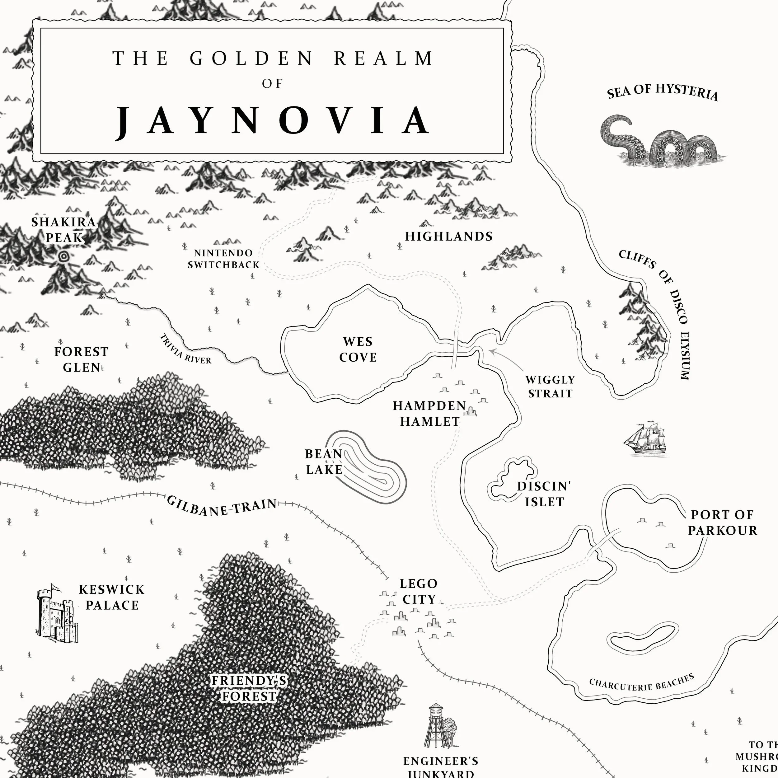
Because this is an entirely fictional landscape, I was able to manually digitize this map in GIS and augment it with custom symbology. The final copy was also printed and further enhanced with watercolor and ink.

-
I designed this map for the #30DayMapChallenge2022 as a submission for Day 3: Polygons.

-
After cleaning and symbolizing this robust tree dataset, collected by Brandywine Urban Forest Consultants, it was coupled with high resolution imagery and a custom layout design for display at the visitor’s center on site.

-
The devil is in the details with this map; created for a property owner, it was imperative that the locations of individual landmarks and points of interest were precise and accurate.

-
Created for a family’s genealogy project, these simple maps helped readers orient themselves in the story of their ancestors’ migration across the U.S.

-
Another product of a field trip, this map displays photos of invasive species in its round pop-ups, which are wrapped in HTML text boxes to match the curve of the circular photos.

-
I made this map to document the routes I walked during an invasive species field mapping excursion, during which I gained experience with several different data collection methods.

-
This suitability analysis incorporated land type, elevation, and slope to determine acceptable placement locations for solar farms.
-
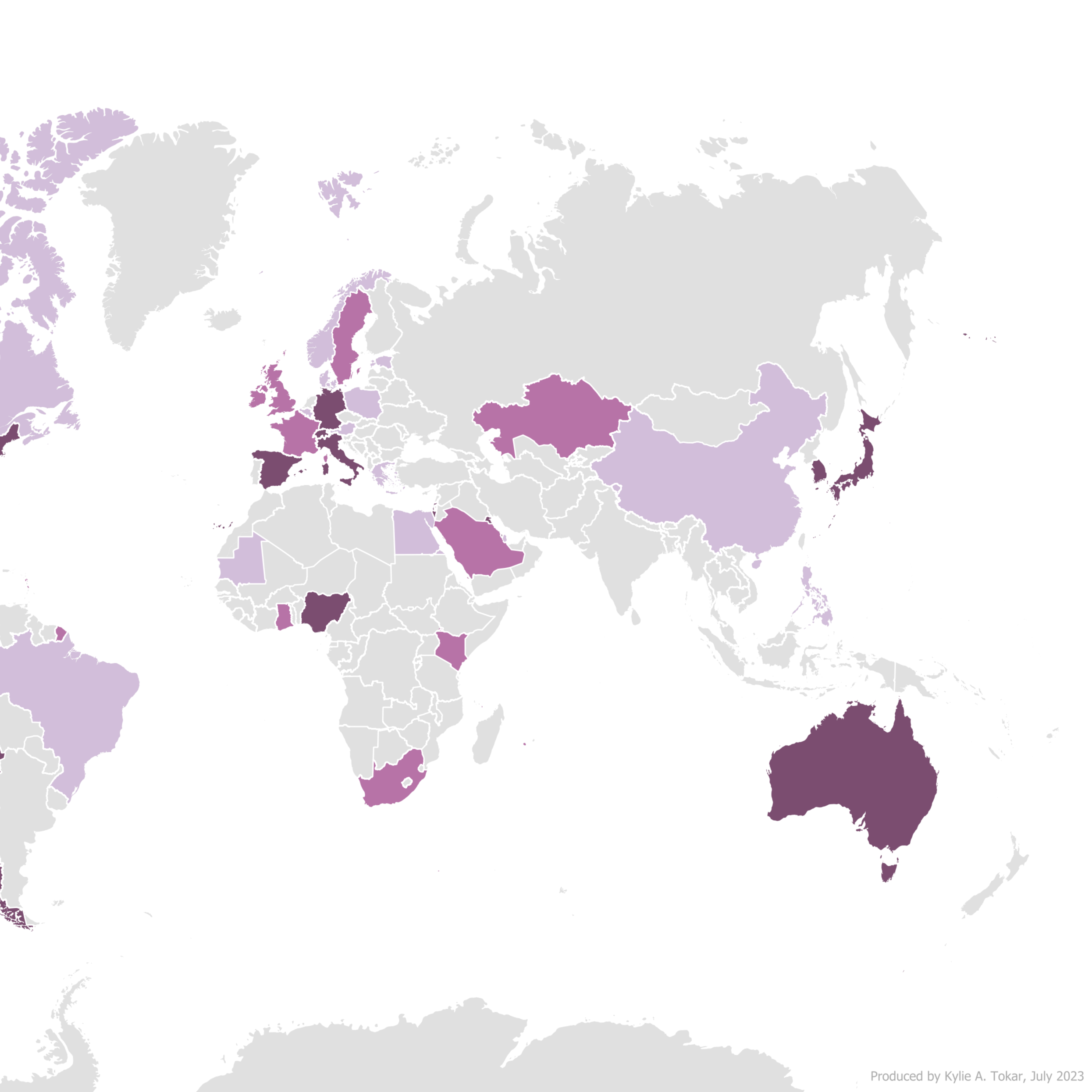
Some Upwork clients require simple and colorful maps to enhance their websites or presentations; this particular map displayed client presence in a variety of countries worldwide.

-
Generated using legal descriptions of a property boundary, this map assisted the client in determining the location of a roadside easement.
-
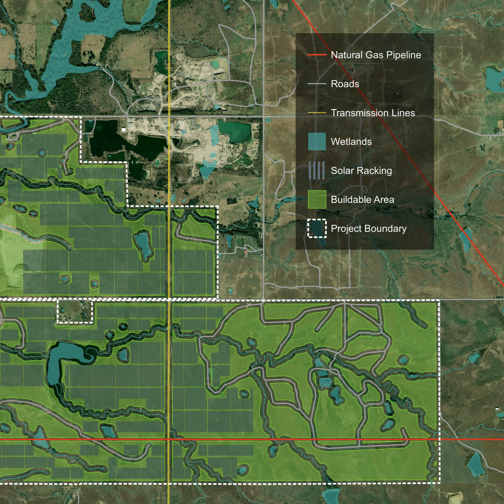
This is a map of a single solar site, including the panel racking itself, nearby wetlands and pipelines, and buildable/ non-buildable zones based on legal restrictions.

-
Grow With Trees conducts compatible species monitoring and biodiversity enhancement along utility rights-of-way, including those within national parks and forests. I have worked with them for years to create maps and spatial analyses for their clients.
This map highlights some of the protected lands surrounding Lake Tahoe, on the border of CA and NV.

-
Developed alongside Indigenous tribal experts, this multi-month analysis combined historical journals and maps to determine migration routes as far back as the year 1500.

-
The client for this project was a healthcare provider searching for the ideal location for her new office. I crafted a series of custom metrics and visualizations using demographic data about the surrounding area so she could make an informed decision about her business.

-
I've been hired by Brandywine Urban Forestry Consultants to create countless maps and geographic products to display their robust tree data (including tree location, health, and other details). This is one ArcGIS Hub Site I built with custom configuration.
-
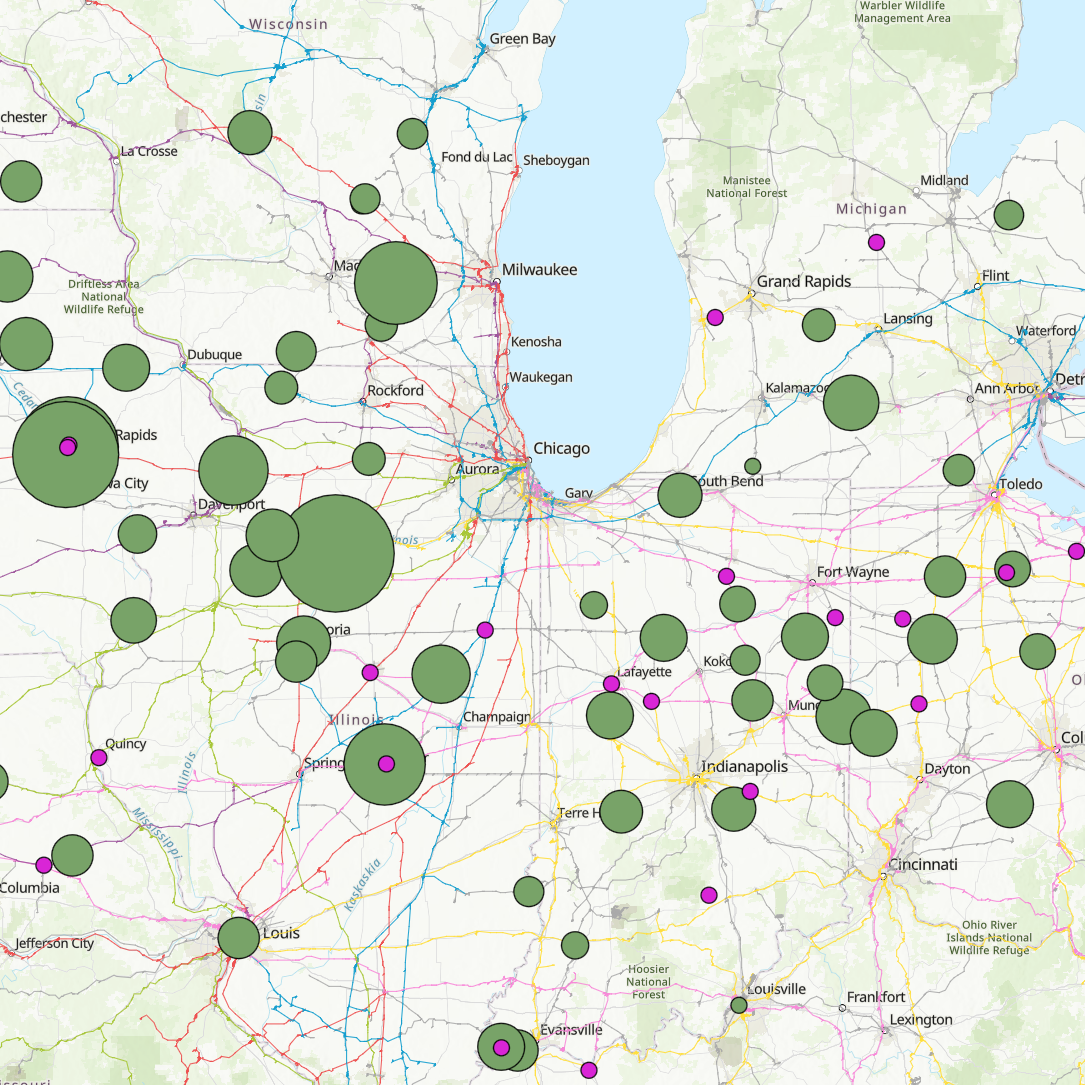
The client for this map requested to portray two types of energy processing sites (soy and ethanol) as well as the Class 01 rail lines that they fell on. This map also has tools and widgets to filter down the data to display only relevant sites.

-
Astriata and the Chicago Metropolitan Agency for Planning hired me to create this dashboard, which allows users to navigate and explore through three different geographic levels of demographic, transportation, economic, and land use data.
-
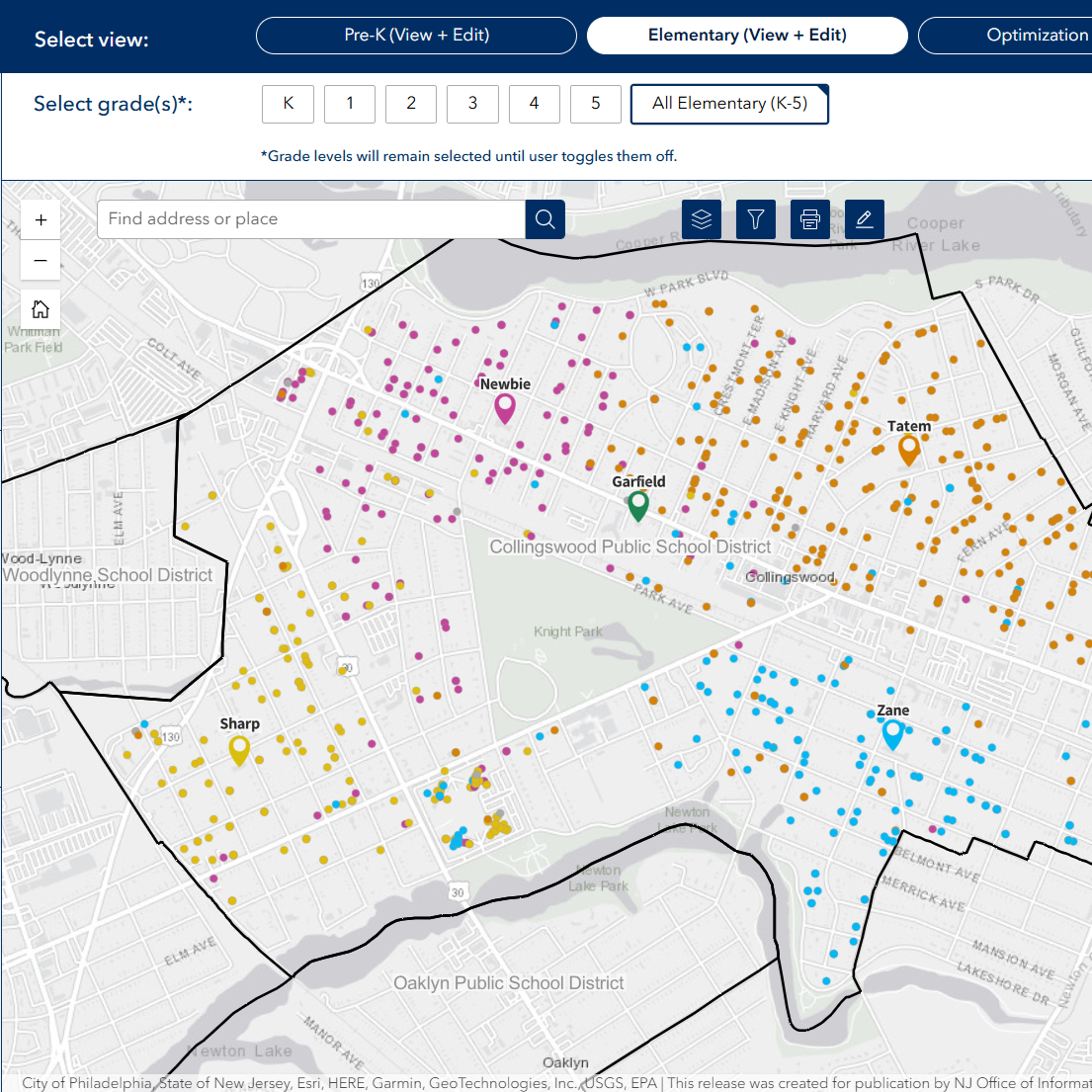
These school system dashboards display distribution of enrolled students throughout a community, enabling administrators to make efficient decisions about facilities and transportation while preserving student privacy.

-
The primary objective of this project was to develop a suitability model to identify the particular locations for the ideal installation of oceanic cooling technology, based on critical levels of multiple criteria, such as salinity and temperature.
In addition to the model itself, the development of this web application served as the Capstone to my master’s degree.